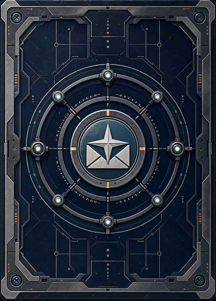
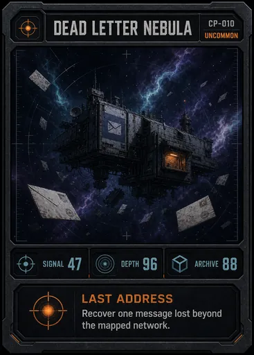
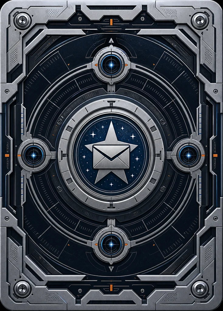
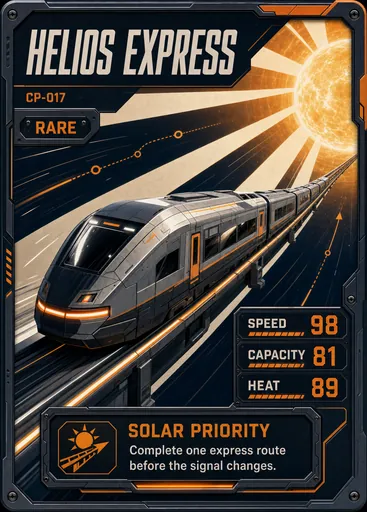
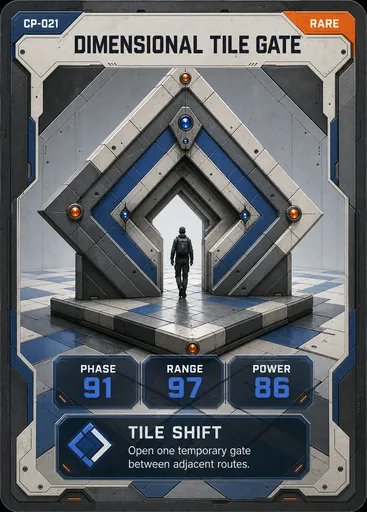
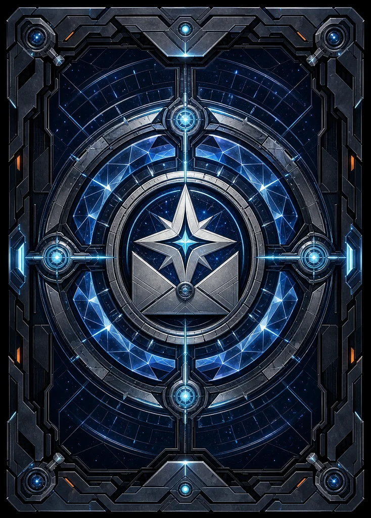
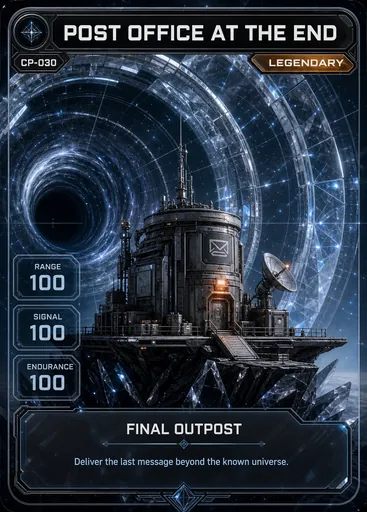
Image faces
frontImage + backImage gives an existing card two tactile surfaces.
React + TypeScript · v0.3.3
A TypeScript component library with 30 interactive foil finishes for image-based cards and custom React content. Bring the artwork; it handles light, tilt, glare, depth, expansion, SSR, and reduced motion.
npm install @taverse/react-holographic-cardImport the stylesheet once. Then choose content, effect, and interaction as props.
import { HolographicCard } from "@taverse/react-holographic-card";import "@taverse/react-holographic-card/styles.css";export function Collectible() { return ( <HolographicCard frontImage="/cards/fronts/002-moonstamp-clerk-large.webp" backImage="/cards/backs/common.webp" backAlt="Common Cosmic Post card back" alt="Moonstamp Clerk" effect="holo" foilArea="artwork" artworkBounds={{ top: 16, right: 5, bottom: 37, left: 5 }} expandOnClick /> );}Give every card a front and a back, then choose whether the flip is self-managed or controlled by your app.
frontImage + backImage gives an existing card two tactile surfaces.
Use frontContent and backContent for prompts, answers, or any React UI.
face and onFaceChange keep the card in sync with application state.
Wrap three to eight cards with stable IDs and labels. The carousel owns orbit motion, selection, drag gestures, thumbnails, and keyboard navigation.
import {
  HolographicCard,
  HolographicCarousel,
  HolographicCarouselItem,
  type HolographicEffect,
} from "@taverse/react-holographic-card";
import "@taverse/react-holographic-card/styles.css";

type Card = {
  id: string;
  name: string;
  image: string;
  thumbnail: string;
  effect: HolographicEffect;
};

export function CardCollection({ cards }: { cards: Card[] }) {
  return (
    <HolographicCarousel
      defaultSelectedId={cards[0]?.id}
      autoAdvanceMs={6000}
    >
      {cards.map((card) => (
        <HolographicCarouselItem
          key={card.id}
          id={card.id}
          label={card.name}
          thumbnail={<img src={card.thumbnail} alt="" />}
        >
          <HolographicCard
            frontImage={card.image}
            alt={card.name}
            effect={card.effect}
            expandOnClick
          />
        </HolographicCarouselItem>
      ))}
    </HolographicCarousel>
  );
}Use a source image, or place presentational React content below the foil layers.
Pass presentational markup through frontContent. The card owns interaction and foil; your application owns the visual language and data.
Membership, loyalty, or event credentials with application-owned fields and branding.
Album drops, digital editions, editorial covers, and generative art metadata.
Status, entitlement, or compact product data can become a tactile shareable surface.
Show edition numbers, verification state, and concise provenance without a fixed schema.
Defaults are deliberate. Add control only where your product needs it.
Choose exactly one mode. The TypeScript union prevents image and React content from being supplied together.
frontImage | string · required in image mode | URL for the front artwork. |
|---|---|---|
alt | string · required in image mode | Accessible alternative text for the artwork. |
frontImageProps | ImgHTMLAttributes | Native image attributes and load/error handlers; src, alt, children, and className are reserved. |
frontContent | ReactNode · required in content mode | Presentational React markup rendered beneath the foil layers. |
ariaLabel | string · required in content mode | Accessible name placed on the outer card control. |
Defaults work for a pointer-driven image card; opt into additional control only when the product needs it.
effect | HolographicEffect · "holo" | One of the IDs exported by holographicEffects. |
|---|---|---|
interaction | "pointer" | "orientation" | "auto" | "none" | Selects pointer tracking, device orientation, both, or a static surface. |
foilArea | "auto" | "artwork" | "notched-artwork" | "inset-artwork" | "full" | Controls where the foil is visible. Auto resolves from the selected finish. |
artworkBounds | { top, right, bottom, left } | Percentage insets for a custom rectangular artwork viewport; Reverse Foil uses the inverse region. |
foilImage / maskImage | string · undefined | URLs for a custom foil texture and mask. |
accentColor | CSS color · library default | Overrides the active glow color. |
effectSeed | string | number · React useId | Makes texture placement reproducible across snapshots or collections. |
autoAnimate | boolean · false | Runs the one-shot showcase motion when the card becomes ready. |
disabled | boolean · false | Prevents activation changes and neutralizes interaction motion without clearing controlled active state. |
Use defaultActive for uncontrolled state, or active with onActiveChange for a controlled card.
expandOnClick | boolean · true | Enables click and keyboard expansion. |
|---|---|---|
active | boolean · undefined | Controlled expanded state. |
defaultActive | boolean · false | Initial expanded state for an uncontrolled card. |
onActiveChange | (active: boolean) => void | Reports activation changes in either state model. |
Choose backImage or backContent. Without either, the component renders a neutral built-in back.
backImage / backAlt | string · undefined | Back artwork and its alternative text. |
|---|---|---|
backImageProps | ImgHTMLAttributes | Native attributes and error handling for the back image. |
backContent | ReactNode · undefined | Presentational React content for a custom back. |
className / style / id | native div attributes | Forwarded to the root along with data attributes and compatible event handlers. |
Ensures only one descendant card is expanded. Use defaultActiveId for uncontrolled state, or pair activeId with onActiveIdChange. Give controlled descendants explicit IDs and do not mix group state with card-level controlled state.
The short version of the library's scope, runtime behavior, and content model.
It is a typed React component library for adding interactive holographic, foil, glare, tilt, and depth effects to card-shaped content.
Yes. Use frontContent and ariaLabel for application-owned markup, or use frontImage and alt for image artwork.
Yes. Rendering is server-safe. Reduced motion disables tilt and showcase motion while keeping click activation functional with immediate recentering and no spin.
Yes. Choose pointer, orientation, automatic, or static interaction with the interaction prop. Pointer input takes priority over orientation, then hands back after a 500 ms release window.
Run npm install @taverse/react-holographic-card, import the package stylesheet once, then render HolographicCard.
30 finishes, driven from the exported holographicEffects catalog.